The many advancements in the domain of web design shouldn’t be underestimated. They allow designers to innovate in ways that they could have never imagined before. Nowadays, you will be hard-pressed to find an art that is progressing at the rate that website design is. It has many applications, especially in the realm of e-commerce. Websites are aching for new and creative ideas that will put them at the forefront of their industry. Here are some ways designers are making names for themselves and their websites.
1. Black and white aesthetics
Colour palettes have always fascinated web designers. They can convey a variety of emotions and they are great at giving your website structure a characteristic look. Certain colors give off very specific vibes. The color blue is often used to give you a relaxed and laid-back atmosphere. Yellow is supposed to be a cheerful color and it should make you feel excited. Combining various palettes can give your website a unique personality to match the products and services that are featured.
On the other hand, there’s no reason you can’t go back in time. Making everything in black and white doesn’t seem like the most progressive color palette choice at first, but you would be surprised at the effect it can have on visitors. It is a daring choice that lets you experiment in every other aspect of your website design.
If the colors are limited to black and white, you are automatically tasked with making the most out of those two colors. That means you have to focus on shading and gradual transitions from one to the other. The visitors on your website might not know the intricacies of good design, but they can appreciate quality visual stimuli. With black and white designs, you can give off a vibe of expertise in contemporary looks. The contrast potential of these two colors will allow you to go wild with your ideas.
2. Micro-interaction

Interactive web design is not exactly state of the art technology. It’s been in every experienced designer’s toolkit for years now. Interactions have followed websites as long as there have been websites, but their form has changed over the years. The difference is that nowadays their form has become even more attractive to e-commerce websites.
You are now able to stage complex and integrated interactions in small details that will make the user experience even more interactive. Users want to feel valued when they visit any kind of website, using quaint little details will make sure of this.
These interactions really do start off small. Things like Facebook like button are great examples of this. It used to just be a button that signaled you enjoyed a bit of content. With the addition of a small animation that goes with your interaction, it became a slightly satisfying little click. This might not seem like much, but it drastically affects user opinion of a website and its functions.
Animations don’t have to trigger on actual user actions. You can make them appear during a mouseover function. The proper combination of animation and sounds can make for very interactive user experience.
3. Glitch art
Glitches aren’t the first things that come to mind when it comes to good web design aesthetics. In fact, you would expect the opposite to be true. Aren’t glitches a bad thing when you’re trying to optimize your website to work? Obviously, this new trend in design doesn’t refer to actual real-life glitches. It’s the thought that counts. You’re not featuring unintentional glitches on your website. Glitch art is a way for you to artificially blur the line between reality and digital chaos.
You can use digital and analog errors as inspiration for your design changes. Animations can feature sudden glitches that give off a surreal and futuristic vibe.
Distorted and striking glitch animations are a contemporary take on older artistic movements like surrealism and the psychedelic movement. They are used to intensify art in a way that will grab the attention of spectators. They give you a sense of disorientation when you look at a piece. They can resonate with your experience of the art, giving you a visceral reaction.
Most importantly, they give off a sense of urgency to users that keep their attention for long periods of time. This can let you show off your product in ways that seem both attractive artistically interesting. Due to their interactive nature, pieces of glitch art allow you to use them in motion graphics and logos in real time. It’s an ideal medium for a surreal and aggressive take on design.
4. Videos

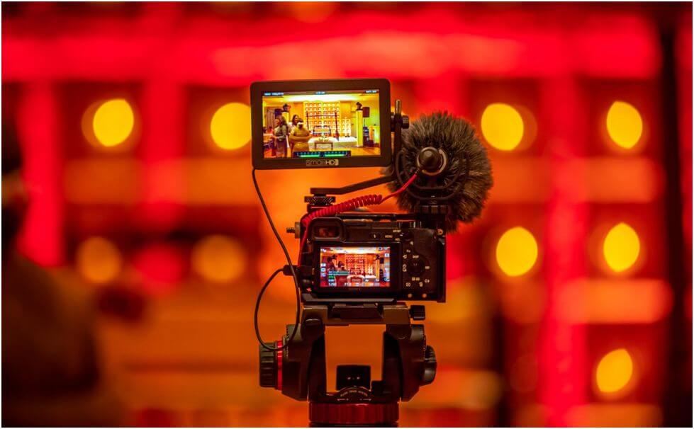
Images and animations are a great way to show dedication to your website, but there’s one thing that people crave more in their content: videos. For some reason, there has been a meteoric rise in the popularity of video content. Users can’t get enough of it. They have become a relatively recent essential element to add to your designer and marketing toolkit.
When it comes to online media, videos are ranked very high on the list of priorities for internet advertising. They provide an unparalleled rate of conversion for websites they’re used on. Users find them extremely relatable. You can have legitimately interesting content in video form without giving off the vibe of an explicit advertisement. There’s something about videos that make them seem highly authentic.
Optimizing videos for your website is quite the challenge. You need to take into account all the metadata that has to be properly marked in order for search engines to find it useful. Doing this might not be in the realm of most designers, which is why they usually seek help from Brisbane GWM SEO experts before integrating videos on their website.
Due to their large bandwidth and size, optimizing your website for videos takes a bit of expertise. Once you’ve mastered the art of compression and size reduction, you will be on your way to providing the ideal user experience.
5. Organic shapes and forms

There are some things that the human eye finds appealing no matter how it’s presented. You might have heard of the Fibonacci sequence, which is also known as the golden ratio. Artists have used this for millennia in order to create art that appeals to everyone. It’s just one example of a natural pattern that we find attractive. There are various organic shapes that you can integrate on your website in order to create a visually stimulating and attractive user experience.
When it comes to website design philosophy, things like systematic grids are becoming a thing of the past. Designers are going away with the typical symmetrical grid and they’re giving themselves more leeway to experiment with new shapes. They want shapes to complement their content.
You no longer have to enclose every bit of text into a rectangular box, you can shift your focus towards making it attractive instead. Distinct shapes like diamonds and kites are becoming more and more popular, and that is only the beginning of this kind of innovation. Trends are heading towards more and more irregular shapes that complement the rest of the website’s organic design.
Conclusion
Web design is advancing ad a lightning fast rate and this year is going to prove it. There are more interesting features than you can count and they’re all being used by designers to create the ultimate attractive website. If you’re trying to cash in on the new wave of design trends, you might want to take a good hard look at some of these examples.
Nick is a blogger and a marketing expert currently engaged on projects for Media Gurus, an Australian business, and marketing resource. He is an aspiring street artist and does Audio/Video editing as a hobby.