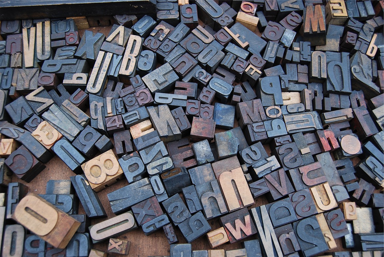
It is the knowledge of typography that helps you decide what font is right for what kind of website. This knowledge is quite useful to distinguish between the best font options from all the others. Of course, you do not need a great deal of understanding the basics involved in typography but it’s quite important that you understand most basics of it when it comes to designing a website or graphics.

Unimpressive Color Palette
Adding up another factor when it comes to ease in readability of font is the color that is selected for the background along with the one used for the text itself. A common mistake is to use two similar tonalities, which makes it difficult to distinguish both background and the text from each other after a point. This may be quite irritating for the readers and is not worth at all for people with vision problems. You should also know that there are few colors that can impact the eyes badly with eye-gouging effect like the green and red or white and yellow when used together can be painful and should be never used together at all.
Center aligned text
Many designers are in the habit of centering the text but it’s not really a good option for the body copy, headlines or anything else on the website. Centering should be used for emphasizing or layout purpose but shouldn’t be assigned as a global style. Body copy is much easier when it is read with left alignment as the eye is used to seeing and reading in that way. Right aligned text can also be easy for the eye to read and a better design option than a center aligned copy, too.

Usage of Too Many Fonts
Many web designers practice changing a monotonous text by using different fonts. The problem is the website ends up with having too many typefaces, which is not recommended. In fact, the font styles in a single web design project should be limited to not more than three. Improper font weights confuse the readers and bold text should be used only for the parts of content which are quite important. This helps the readers to not miss out on something that is important in the page that has lot of text in it.
Consider Typography as a Hierarchy
Use a hierarchical pattern when you are assigning the fonts, sizes and colors to the text to get much better productivity in the pages. By using such hierarchy of typography you make the text easier to read and absorb for the readers who can search for what they are looking for quite easily on the page. Obviously the readers should understand what the titles are, the subtitles are and so on. This divides the text in neater segments that draws attention to the relevant parts making the text easier and enjoyable to read.

Readability Issues
The text should be planned in a way that it is easy on the eyes. Apart from putting detailed attention to the typographic hierarchy, it also includes adjusting the font size too for easy readability. Apart from making the font size large define the line spacing well enough too to make it readable. The images on the website should always carry keyword optimized ALT Texts. In this way you are not just taking care of the SEO but also helping the readers out who aren’t able to display images on screen or who are seeking a little information about what they are searching for. Captions work well for SEO and helps in telling a story about the image so that the audience is engaged.
Excess usage of Decorative Fonts
Decorative fonts can really look stellar and there are many examples of their uses. But if it is not really necessary then don’t use it in your design or use it to the minimum. Agreed, they do have some visual appeal but decorative fonts can hamper the readability to quite some extent. Most common usage of decorative fonts is for the text logo and first letter of the article.
Improper Kerning
Kerning is a term used for the process of adjusting size that stays between the letters in a word and increases the legibility of the copy. It may involve increase or decrease in the space between letters. Unnecessary spacing between the letters can affect the look of design a lot. Kerning is not an issue with the common text but is quite important when you add letters to web images.
Large Sized Font
Small font sizes look very professional but should be adjusted well so that they aren’t too small to read. Many designers use relatively large-sized fonts for the body. But it can look quite improper like a children’s book. So try putting in smaller font size and understand that content on screen looks different then how it shall look when printed. Adjust and find a better size that isn’t too clunky or too timid for to suit user readability.
Unwanted, Boring long lines
Finally ensure that you have optimized your line length. Many claim that lines that contain 40 to 60 characters are better to perceive but it is difficult to provide a definite range of characters as it can be quite varying depending on the page layout, type of text, formatting, and other things. Adjust it yourself to find the balance and perfect measure suiting each particular page. Reading many long lines can result in fatigue so steer clear of it.
Hopefully these tips have highlighted the common typographic mistakes that occur and help you to avoid them for your design. Thankfully, these issues are easy to fix and now that you know what to avoid you can have a better and easier text that will create a great impact on the minds of the readers.
Deb Dey is the CEO of a small content writing agency – 3Leaps. He loves writing articles on a wide range of topics, especially on topics related to marketing, small business and tech. When he is not busy, he loves exploring nature.