If you create a website for your products, one of the most important areas will be the product page. A product page refers to one of the main pages in a website where customers can view all the products. The page impacts the business’s sales, and hence it should be beautiful. You can either create something simple and direct or go for something fancy and creative. Either way, the main focus should be on providing an authentic and delightful experience for the customers.
The product page helps the business to sell more products since it will entice your customers to buy your products. Apart from selling products, the page also allows you to achieve a high search engine ranking resulting in more customers. Therefore, creating a well-organized and beautiful product page is essential. This blog will cover specific tips using which you can make your page attractive and informative at the same time.
Tips for creating an effective product page
Before beginning your product page design, there are some crucial factors that you should know and consider. They are:
- Target Audience: Recognizing your target audience is one of the significant steps before designing your page. To create a successful page, you need to understand the preference of your customers and build accordingly.
- Brand identity: Knowing your brand’s identity is important to create a good experience for your customers. Therefore, while designing your product page, you must include it on the page.
Having a basic idea about these factors will help you create an effective product page. They are vital for every business and affect the sales of the company.
1. Choose a color scheme
Every colour has a specific meaning. While red is the colour of love, blue symbolizes trust. Therefore, you must be precise while choosing your theme. It is an essential decision since it will affect the entire look of the page. Along with the colour scheme, you must also choose a compatible design with the colour. Both of them will be consistent throughout your website, including your product page, and hence go for something that your target audience will prefer.
2. Contents of a product page
A product page contains information about the product. It talks about the product’s features and price and provides an overall description of the product. The page contains reviews and ratings of customers and suggests other similar and available products on the website. Despite having so much content, people usually spend around 15-20 seconds on a product page of any website.
Therefore, you have a concise period after the arrival of your customers on your page to create a buzz in them regarding your product. So, you must include the essential details of your product on display prominently on the page. Format your page’s layout as per the preference of your customers.
As per intel, people usually prefer reading the page from left to right, so arrange your product information accordingly. Lead with the product image or description on the left and then continue the rest on the right. It will help you gain your customers’ interest, making them excited about your product.
Product Description: Additionally, one of the major items on a product page is the product description. Generally, product descriptions sit either above or below the fold. Above the fold states that the content is present at the top of the page, i.e., you don’t need to scroll down the page to view it. Below the fold means the exact opposite, i.e., you must scroll down the page to view the content. The product description will help your customers gain insight into your product in a better way. Keep it a short and crisp description above the fold, and then if you want, you can keep a long and detailed one below for those who want more information.
The product description acts as a supporting pillar to your product images. It helps the customers understand the product’s details and allows them to know about its features and benefits. Usually, customers look for compact and easy to read descriptions, so you must write accordingly to satisfy their wants.
Be thorough and inform the customers of every little detail that they should know about the product. You can even include a short video of your product since this is the best place to provide all the extra information to your customers, apart from a thorough description, including the reviews and testimonials of other customers on your product page.
Shoppers usually get influenced by the opinion of other people who have already purchased the product, so, therefore, do not feel sceptical about including those. It might be the driving element that allows your customers to buy from your page. Include as much feedback as possible for a better overview and understanding of your product.
3. High-quality product image
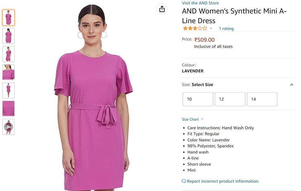
After the description comes to the product image, it is also an integral content of your product page that determines the product sale. The product image mostly stays above the fold, i.e., at the top of the page, since it is the first thing customers look for. As per research, almost 93% of shoppers buy products based on their image, and hence you must be careful that it is prominently visible.
Product images build the foundation of your page, and hence they must be of high quality. You must plan them thoroughly and ensure that they define your product clearly. While buying things online, customers are often sceptical since they cannot look through things like they can in a physical store, so the product images are the best option that they can have. High-quality images result in a higher persuasion level, making your job easier.

Image Source: Amazon
Try to use more than one image for a better view. Help the customers visualize the real product by showing them different angles. If you want, you can even use lifestyle images to tell the story of your product. Use other props and locations and provide a better context for your product.
4. Offer transparent pricing
Firstly, try to put your product pricing above the fold so that customers don’t have to scroll through to find out the cost. Pricing is another important factor that directly determines the sale and purchase of your product. Customers will not opt for a product without knowing its exact price, so it is beneficial to put the price on top of the page for a better view.
Your pricing should be transparent and should not create confusion among the customers.
Because if it is confusing, no matter how unique your product is, it won’t be enough to convince the customers. Be clear about your pricing details, even if it is expensive. You can even use a bigger font size or colours that pop up for writing the price if you want.
Often, websites have ongoing offers and discounts for their products. Include them around the area of your price as well. Highlight them with brighter colours if possible to catch the attention of the visiting customers. They will be automatically drawn to your website if the discount and offers are visible.
5. The call to action option must be persuasive
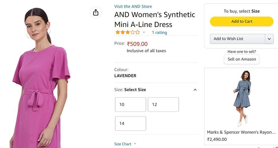
A call to action or CTA refers to a link or option that allows users to take action after viewing the product. For example, the “add to cart option” or the “shop from this collection” invitations. They should be above the fold, i.e., at the top of your page. It is an essential part of the shopping experience, and failure to locate it on the page might result in a loss of sales.

Image Source: Amazon
The main focus of the product page is to influence its customers to click on the call to action option so that the effort and time you included are worth it. Therefore, ensure that your product page is appealing enough to influence your customers to click on the CTA option.
6. Use appropriate language for writing the product page
Using appropriate and direct language is one of the ideal factors in creating a good product page. Identification of the target audience is important for this factor as well. No matter how fancy or simple your product page is, if your customers’ language is not understandable, then it won’t be worth it. Therefore, use language which is direct, easy, and can be understood without any hassle.
You can even create a multilingual page to reach a wider audience. It will be advantageous for you since your product page will be viewed by people worldwide. It will provide a better experience for the customers and benefit from understanding your product in the language they are comfortable with.
7. Accurate product recommendation
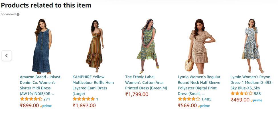
Provide product recommendations below the fold of your product page. It is a valuable and innovative way to engage the shoppers in spending more time on your website. It will help create a personalized experience for your customers and help them know about the other products available on your website.

Image Source: Amazon
Nevertheless, you must ensure that the product recommendations available on your website are accurate and helpful. Don’t put products that don’t have any relation with each other just for customer engagement. However, you must also keep in mind that along with being beneficial, product recommendations can be distracting as well. It might distract your customer and keep them from purchasing the product they initially came to buy.
Summing It Up!
A product page is an integral part of a website. You should work on it thoroughly to make it effective. Use the tips mentioned above to create an attractive product page. However, don’t keep yourself restrained to those tips only. Be creative to create a page that your customers love and support.

Vishal Lakhani: CEO and Magento Solution Specialist at Rock Technolabs with over 10+ years of experience in eCommerce. Apart from blogging and playing with Magento, he loves to read, travel, and learn new technologies that help make the development process easier and more appealing to clients.