Source Photo by Campaign Creators on Unsplash
Business owners! I have got to tell you one thing, out loud.
“Without a well-designed website with engaging user experience, scaling your business will remain an uphill struggle.”
Whether you own a herbal product brand or provide marketing services to small business owners, you can’t survive without a good website.
A good website will help your business get the required visibility and act as a foundation of your online presence. As revealed by the WebFx, 75% of users’ judgment on a brand’s credibility is based on its website design.
Apart from that, your business website will extend your reach to potential buyers not just in your region, but globally. Therefore, you must invest your time and resources in compelling and research-backed website design and don’t forget to find the right graphic design service to get the website design your business needs.
A slow-loading webpage, unresponsive design, complicated navigation, and lack of coherency can repel a visitor in seconds. Why would they ever hit on that “buy now” button while being annoyed with your website?
After surveying several successful businesses’ websites, we have compiled a list of best web design practices. We are sure that if you take care of the following, your website will bring in a lot of ROI for you.
1. Using responsive web design
Eye-opening statistics were shared by Search Engine Land, where it was revealed that almost 94% of business websites are not mobile-friendly, although 80% of consumers are using their smartphones to research and purchase things.
Designing a website that adapts to multiple devices is the key to get a higher conversion rate. Visitors should have a consistent experience while browsing your website on mobile or desktop.
Billions of people worldwide own a smartphone now, and they use it to access every kind of content. When they need to buy something, they are more likely to search for it on their phone rather than open their desktop.
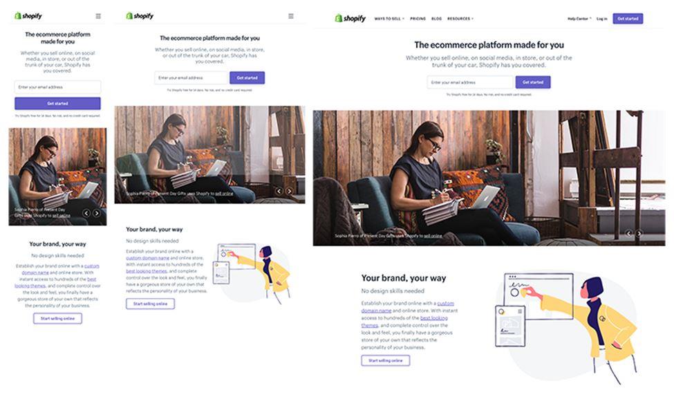
Web designers use CSS to create flexible grids on a responsive webpage. The columns are rearranged automatically depending upon the device’s screen size, giving the users full control over their browsing experience.
Shopify’s responsive web design is quite impressive, and one reason why they keep their users engaged.

2. A fast loading website
Nothing annoys a visitor more than a sluggish website that takes ages to load. In today’s fast-paced world, no one waits for a website to load. A slow website is closed by a visitor faster than the blink of an eye.
The StrangeLoop case study revealed that as much as a 7% loss in conversion could happen by a 1-second delay in page load. Prioritize speed optimization in your web design to give an incredible experience to your visitors.
You can optimize image sizes for a better performance by using image compression plugins like Imagify. Using a Content Delivery Network (CDN) is also a great way to load your website quickly in any location worldwide.
3. Indexed by Google
I don’t need to tell you why it is crucial to rank high in search engines. You know it well that your business’s success is linked to ranking high in SERPs.
Imagine you have prepared a dish. Now you are about to serve it to the guests, but you haven’t added any garnish, and the guests have no idea what it is. Will they prefer a visibly-unappealing dish about which they know nothing? No! They’d move on to other items on the table.
Similarly, if you don’t tell your customers about your business, they would happily move to your competitors. SEO helps you here. It is a way of telling people what you do and how you can solve their problems.
Search engines easily index sites with a proper URL, sitemap, and quality content with relevant keywords. Therefore, incorporating these SEO elements will ensure your website ranks high in the search engines.
Besides these essential SEO elements, businesses should add on-page SEO tags and Schema code to their website. Schema helps the search engines understand your site better and show it to the target audience.
4. A clear, coherent layout for seamless navigation
Conversions, bounce rates, and sales are highly dependent upon the navigation of a website. Expert web designers suggest keeping the number of items in your menu to a minimum to avoid overwhelming the visitors.
If your homepage looks cluttered, it is probably not going to hook the visitor for long. Instead, if you have displayed the necessary information clearly, it will look appealing.
You can use the footer to display all the essential links rather than showing them up on the menu bar. Take an example from the Zappos website.

Do not annoy your visitor with too many popup messages, and worse, auto-play videos. No one likes them.
A clean, simplified homepage with a soothing color scheme is your best bet. Get rid of all the irrelevant elements, stocky images, and excessive animations from your webpage.
5. Campaign landing pages for higher conversions
Landing pages can turn your potential customers into your regular customers. On a landing page, customers can view relevant information and take action.
For instance, they can schedule an appointment, request a demo, or even make a purchase. These pages are designed for conversion optimization, so adding them to your website will work wonders.
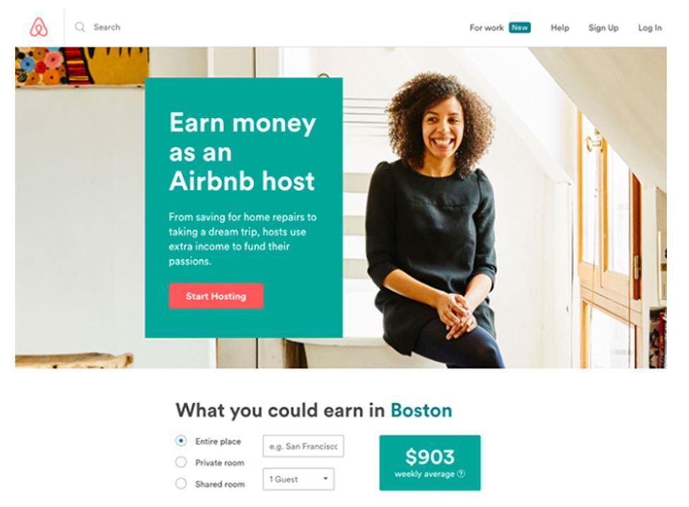
Here is an example of a killer landing page from Airbnb.

6. Prominent display of contact details
This practice is certainly a no brainer, yet so many business websites lack this essential element in their web design.
Your visitor must not have to look for your contact information like it is a hidden treasure. Display it prominently on your homepage to make conversions easier.
7. Quality images
According to the CXL blog, high-quality and relevant images draw more user attention. You may have the best product or service in town, but visitors will not think of you as a credible business unless you display it via good quality imagery.
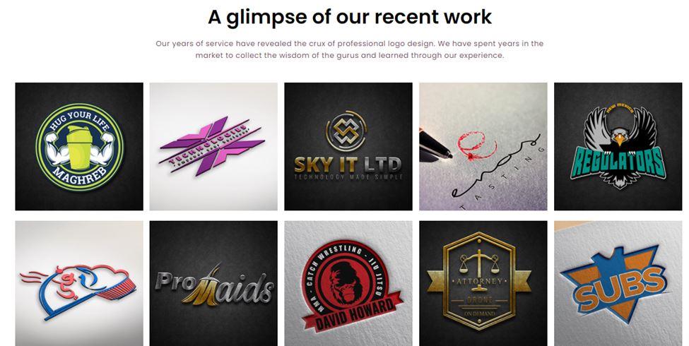
Take the example of Logo Design Valley. They have displayed their recent work using high-resolution images on their website’s homepage to make it attractive for customers. It also enables their customers to view their portfolio quickly without the need to navigate the site.

Images on your homepage appeal to the customers and give them an idea about your product and services.
8. Content that hooks the visitor
Whether it is your web copy, product description, or a blog, appealing content always wins the heart of visitors. The content communicates with the viewers, informs, and educates them. It also urges them to take action.
Using relevant keywords is also a vital element to help your content reach the target audience. If the keywords you are using match your target audience’s search intent, it will directly impact your conversion rates.
9. Simple yet compelling CTAs
All your efforts to market your business would go waste without a compelling Call to Action (CTA) button.
A perfectly crafted CTA will tell the visitors what they need to do and motivate them to take action. Though no rule mentions the call to action’s length, it’s better to be concise and clear. Otherwise, it will confuse the visitor.
Use no more than two to three CTAs per webpage, and always do A/B testing to check its effectiveness. A/B testing is a simple test that you can run to see whether a specific button, color, or content is getting a high number of clicks.
10. Social media
Social media has immense power in today’s world. It can make or break a business; hence it is increasingly being used for marketing purposes.
You can also integrate Facebook posts, comments, reviews, and Twitter cards in website design to make it more social media-friendly. Also, make all your content shareable on social media by embedding share options on each page.
Adding social media icons in your website’s header will let the visitors know about the social platforms at which you are present. If your website requires customers to log in, then give an option to register or login via their social handles like Twitter and Facebook.
Expert designer and developer from Viral Heat, Adam Kirkwood, says that the option to login via social media shortens the process of registration, which increases conversion rates.
Videos are also a great way to help a visitor stay on your website for a long. You can embed YouTube videos on some of your webpages and take advantage of the conversions that visual content brings.
11. Email marketing
To build a strong, one to one relationship with leads and customers, email marketing is a highly effective strategy. It is a sure-shot way to increase traffic to your website and keep your name fresh in the customers’ minds.
You can craft your emails for higher conversion using multiple strategies like using the art of storytelling, videos, and incentives like special limited-time offers, etc.
Final Word
These are the web design practices that have proven to be successful in bringing conversions to many brands. You can safely use them on your business website and reap the benefits.
However, we would suggest you keep track of your website analytics and the traffic you are getting to enhance your web design benefits and grow your business.