Getting a lot of traffic on your website feels great right?? But if that traffic is not converted into conversion, than you need to optimize your conversion rate. Incase you’re new to this “Conversion Rate”, Your site’s conversion rate is the number of times a user shops something from your website or fills up a form (depends on what is the goal of your website) divided by your site traffic.
When the site is not having conversion rates , what mostly people do is they change their marketing campaigns, pause their digital marketing agency & Content optimization or even redo their targeting. But before jumping onto that, it is very necessary that you give enough of time for optimizing your website. In this article I will be sharing top 31 tips that will help in enhancing conversion rates for your website (Whether it be an ecommerce site or a blog)
NOTE: Keep in mind that these tips might wonderfully increase your conversion rates in one situation, whereas it might not work in another situation. So, take these tips as ideas that you can test to increase your websites conversion rates.
21 Tips to Increase Conversion Enhancement
- Call to action
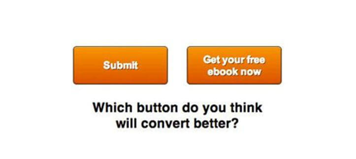
Test your call to actions, i.e try changing their places on the website and notice the changes in conversion rates & then accordingly finalize its place. Also, Gone are the days of boring call to action texts. People tend to click more on catchy call to actions text. For example
Instead of “Sign Up” or “Buy Now”, you can use “ Give me the deals” or “ Instant Quote” or “order now”
- Shipping Prices
Shipping prices have an huge impact on conversions. Include shipping prices which automatically updates in the cart as the user adds or removes items from the cart. Try having free shipping above a certain amount, this can help to gain a lot of conversions.
- Unnecessary Information
Don’t ask the users to enter unnecessary information. For example when signing up, asking their mother’s name is of no use. The same goes with nobody should have to enter their physical address to subscribe to a newsletter.
- Deals with Bonuses
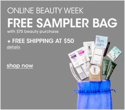
Who doesn’t like free stuff?? You can use this tactic to increase your conversion rate. Do giveaways or give them a special gift when they shop for more than certain dollars Or else Offer free shipping or some percent-off discount on their next purchase, and watch your conversion game getting strong.
- Warranties & Guarantees
Test out different types of warranties & Guarantees. If your competitors are providing 30 days warranty, then you can provide 60 or 90 days of warranty.
● Exit-Intent Popup
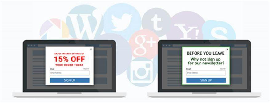
With exit-intent popup, you can convert your visitors abandoning your website into increasing signups. All you have to do is use this popup to offer your lead-magnet or content upgrades. A research has shown that some of the websites have seen as high as 600% increase in signups using Exit-intent popup.
- Holiday Shopping
Holiday seasons are the best to convert your traffic into conversions, for this you have to notice the time of the days, day of the week and how many days are remaining until the holiday season starts. And then accordingly maximize your offer exposure.
- Images
Use real photographs instead of stock photographs. Nobody is going to believe you even for a minute that you have always smiling and drop dead gorgeous staff. And this doesn’t mean that you should not use pictures of happy & smiling people, these kind of photographs (real people smiling instead of stock photographs) have highest conversions rate.
- Avoid distracting the customer
Make a list of how you can reduce Distraction on your pages. Especially remove those unnecessary links that don’t have any specific purpose from your landing pages.
- Floating Bar
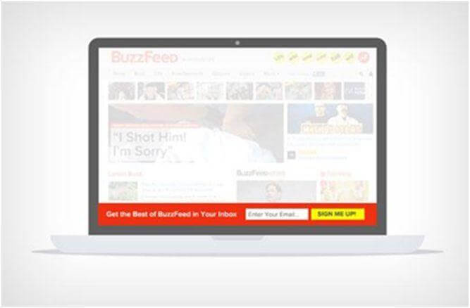
Floating bars scroll along the users screen & stick to the bottom or top of the web page (according to your preference). These floating bars are highly effective as they are catchy & highly visible.
- Testimonials and Reviews
A study by Zendesk found that 88 percent of respondents said their buying decisions were influenced by positive and negative reviews. After security seals, testimonials and reviews from existing customers or industry expert increases the trust factor of visitors.
But instead of putting all the reviews & testimonials on one page, put them alongside the product to help increase credibility and trust.
- Freebies
Give rewards points or free stuff to your customers when they fill out some additional information during survey or feedbacks by placing it on the Thank You page for their participation.
- Unpleasant surprises
Don’t barge in the hidden fees, other extra charges or other extra issues on customers once they begin checking out. This increases the bounce rates at checkout pages.
- Live Chat
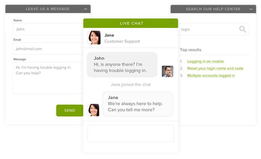
Offer a live chat options to help visitors to get their queries solved. This gives you a chance to interact with the visitors who normally wouldn’t take the time to contact you.
- Privacy Policy
You think your customers don’t go through the privacy policy?? Well you are wrong, they do. But if your privacy policy is not to the point and has extra points to it, there are chances that your visitors are going to abandon your page. So, it is a good practice to keep your privacy policy short & up to the point.
- Important Information Above The Fold
Your call to action buttons or any other information that is very important should be placed above the fold. This makes sure that your visitors can see it clearly when they visit your page.
- Use active language
Along with texts like “Buy” and “Subscribe”, use active language tags like “For Limited Time”, “Before 31st December”, “Only for today” to create an sense of urgency. And do stick with it, customers don’t like liars, so, if you are using “Before 31st December” make sure the deal ends on 31st December.
- Breadcrumbs

Let the customers know that on what page they are, with breadcrumbs navigation is made easy for the visitors as they can exactly know on what page they are. Don’t make them guess on how to navigate your site.
- Checkout Process
The shorter the checkout process, the better it is for your customers. Look if you can shorten your checkout process by eliminating the extra fields.
- Privacy
Never forget to remind your customers that they are important to you. Include Unsubscribe option with your every email. Also include the link to your privacy policy on your subscription form.
- Twitter Lead Cards
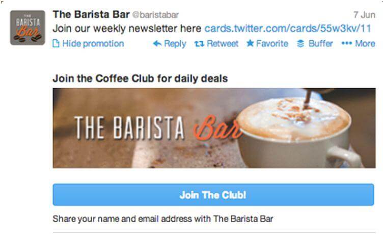
As you might already know twitter is a huge social network. They have an feature for lead generation specially for businesses and it is called Lead Cards. Twitter Lead Cards allow you to collect user’s email in exchange for an offer. This one-click signup can definitely boost your conversions.