Imagine entering a brick and mortar store that looks unkempt and disorganized. Your first instinct would be to leave the store and visit another shop. However, a benefit that brick and mortar enjoys is that the next shop might be at a certain distance away so you might still shop from that disheveled store – while making a mental note not to come back.
Now imagine the same scenario with an online store that looks like it was designed in a rush. You are not impressed at all and you want to leave and shop from other similar store. Now literally speaking, the only thing that stops you from shopping elsewhere from other similar online stores is a click of the mouse – unless you are looking for a truly unique product that is not offered anywhere else.
Hence, an online store cannot afford to take the risk of compromising on their design. For an online store, first impression is the last, period.
Good website design is therefore, not only about beauty and aesthetics. It’s more about attracting customers and boosting sales. Hence, there is no way you can ignore this aspect of your website.
Here are 6 website design tips that will help attract customers and increase conversion rates.
1) Clear Navigation
Clear navigation is one of the most important aspects of web design. Whether its mobile view or desktop view, your website should be easy to navigate around. If it takes a while for your customers to figure out how to find what they need on your website, it’s a good indicator that your navigation needs to be improved. You can test your website and run surveys to see how easy your website navigation is and if your customers face any problems figuring out what to do next.
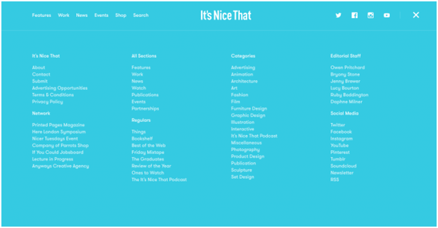
2) Good Quality Images and Graphics
High quality images and graphics give a good first impression on your customers. They make your website look beautiful and professional. If possible, go for custom images and graphics that best describe what you do or what you sell. However, you should optimize image sizes to make sure they don’t take up a lot of time to load.
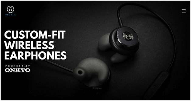
3) Compelling Content
When it comes to your homepage copy, aim for less but very powerful and compelling content. You should speak your target market’s language – for example, a website selling something related to the finance industry will have different language than a website selling some beauty or fashion product. Your content should make it easy for your customer to understand what you do and what you sell. Last but not the least, keep it short – no one wants to reads lengthy paragraphs on a home page.
4) Keep It Simple
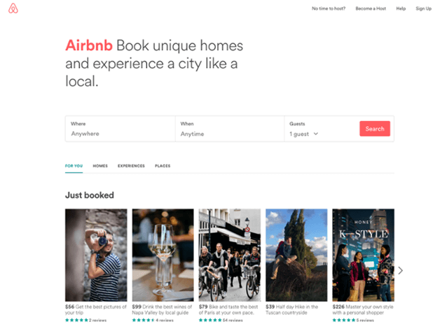
When it comes to web design, follow the age-old adage: K.I.S.S (Keep it simple). Sometimes, in an effort to make their websites stand out, web designers tend to make the design overly complicated, which is a big turn off for customers. If your customers can’t figure out what to do on your website, they are likely to go elsewhere, no matter how beautiful your site looks and how striking the color combination is. Ultimately, it’s the ease of use that wins. So, keep it interesting and attractive but simple. Use an interesting and simple layout and use simple typography instead of some fancy one that your customers might find hard to read.
5) Avoid Being ‘Salesy’
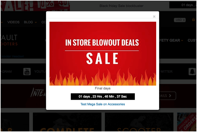
If your visitors are welcomed by clickbaity promotional content that feels like spam, they are not going to be impressed. In fact, it gives an unprofessional look and makes your website look untrustworthy. Have someone go through your website to catch these ‘salesy’ parts of your website. You should also be cautious when using pop-ups as too many of them can feel like spam.
6) Use Call To Action Effectively
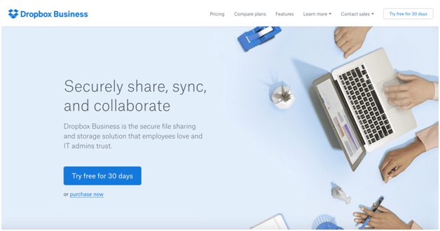
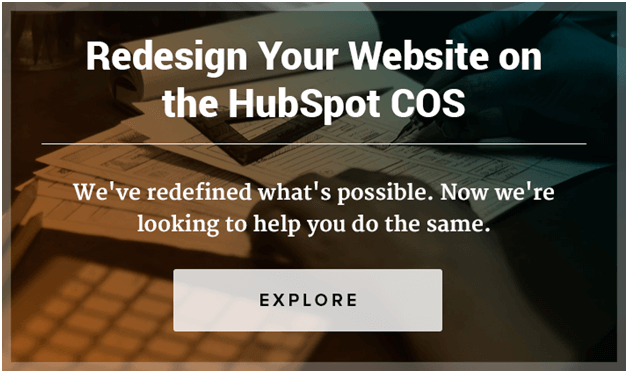
Do you expect your customer to scroll all the way down to the bottom of the page to be able to find a call to action button? If yes, you are just taking a fruitless risk of losing a good prospect. Your call to action button should stand out and should be placed at strategic places on the website so that the customer can easily find them and use them to navigate your site. You should invest time in A/B testing to figure out the best placements of Call to Action buttons. One place that most web designers find effective is the space above the fold of your website. Placing your call to action above the fold means your customer will not have to scroll down to be able to find a button to click next.
The main goal in web design is not just to make your website stand out from the crowd but also to attract customers and increase conversion. A good website design is one that entices and engages your customers so that they stay longer on your website and lead to a boost in sales.
Want to reduce bounce rate? The solution may be lying in your website design. Consider the above design tips and tweak your website for a growth in conversion rate and higher sales.