Do you wish to improve your website conversion rates, and hence sales?
Well, you are not alone. As the world moves towards digital media, many brands are fighting for being the first choice of customers.
Yet, the conversion is not that easy. According to an analysis conducted by Word Stream, the average conversion rate of websites is 2.35 percent. Only the top 10 percent of companies are witnessing a conversion rate five times the average.
To compete with the increasing competition, it is essential to improve your conversion rates. One way to do so is by improving your web design.
You will be surprised just how many people abandon your website due to poor web design.
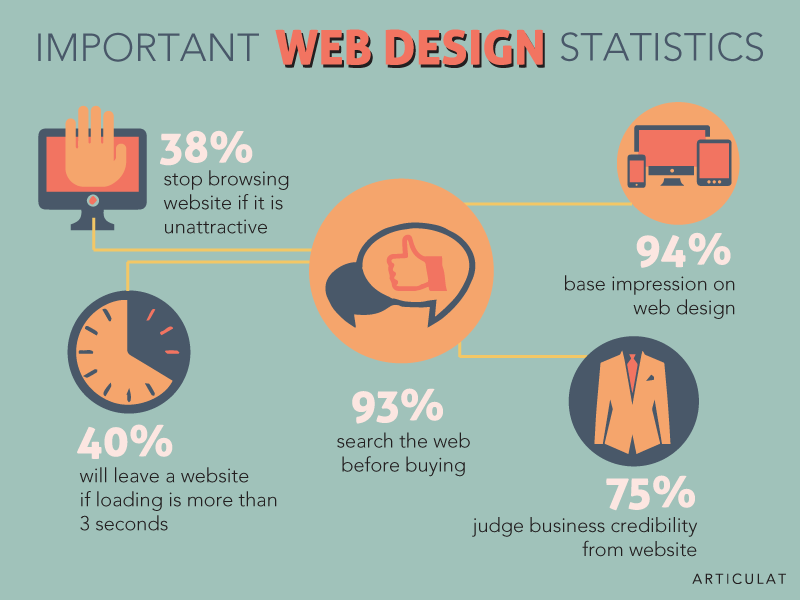
As per research conducted by Gitte Lindgaard and Gary Fernandez, the impression of a website is made in less than 50 milliseconds. And over 57 percent of visitors won’t recommend a website to others if its design was poor.
So, for the sake of your brand image, conversion, and sales, you must improve your web design. Here are simple ways you can do so.
- Ensure your logo is visible
Branding your website is essential for business. As per Pam Moore, consumers require at least five exposures to a brand’s logo before being able to recognize it. And once they recognize it, they are more likely to remember and trust it.
Let’s take Nike as an example. If you were to see the swoosh logo on anything, you would automatically realize that the brand is Nike. This will assure you about product quality, and you are likely to complete the transaction.
To leverage your own branding efforts and to further build brand recognition, it is imperative to place your logo strategically on your website. It should be among the first things consumers see when they visit your website.
Throughout the experience, it should be present on the page to ensure optimum exposure. While you are at, also make sure to choose a professional logo design.
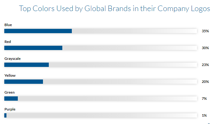
Just like web design, the design of your logo also helps in forming an opinion of the brand, and hence in boosting sales.
- Keep it simple
As per Infront Webworks, slow loading speed can cause an increased seven percent loss of conversions. One of the biggest reasons for a slow website is that its web design includes a lot of items and elements.
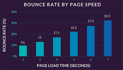
Adding every information on your website is the worst thing you can do for its web design. Instead, the key is to keep it as simple as possible.
Remove all unnecessary items from your web design. This includes additional tabs that are not needed. Also, make sure to have at most three color schemes in your site. Leverage negative space rather than trying to fill it all up.
Anything that does not serve the purpose of converting customers should be abandoned. For example, you don’t need verbose content and dedicated pages to discuss how a product is made from scratch. You can do so via an infographic on one page.
Trim away the extra design and content elements. Revisit all that is left to make sure that it is coherent, polished, and crisp. Instead of unnecessary design elements, now you can add functions that are helpful functionally. This may include a book, an appointment feature, live chat or size charts, etc.
- Optimize your design for mobile
Have you created your website, keeping in mind the dimensions and requirements of a desktop? While there is nothing wrong with doing so, it is time that you also make an effort to optimize your web design for mobile.
Why?
Well, mobile usage relative to a desktop is now increasing.
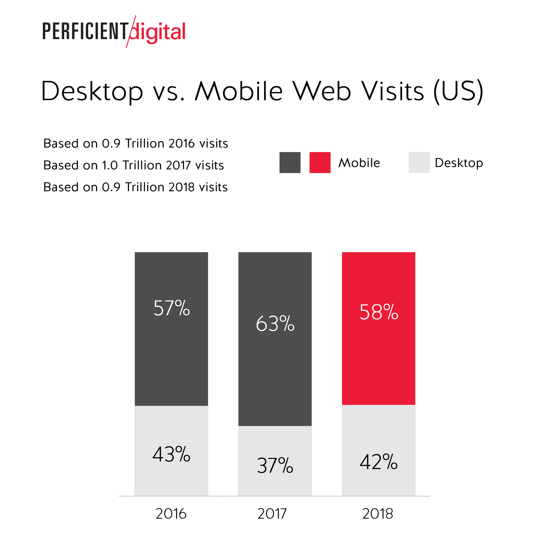
Now, we see a rise in mobile shoppers that rely on tablets and smartphones rather than desktops. And if such customers have to pinch and zoom your site on your phones, in an effort to browse it, you can bid a good conversion rate goodbye!
As per Visually, 85 percent of customers think that a brand’s mobile website must be better, or at least comparable, to the desktop version.
Remember, within the world of smartphones, there are quite a lot of screen sizes. Websites need to feature mobile responsive designs, whereby the display of the site can automatically be adjusted based on the pixel width of the device being used.
Moreover, also make sure that your mobile web design is easy to navigate and intuitive in nature. It is much harder to navigate websites on phones than on a desktop. You must also rethink how you will display information and where you will place the different functions and tabs.
For instance, let’s say you are a construction company like Emaar. Generally, the tab for floorplans of a given project might be on top. But, in the case of a mobile website, it is must better to place the tab on the bottom and only include essential tabs on top. That too in the form of a list.
- Use the F-Layout Principle
What good is a website design if it doesn’t get noticed by consumers? Regardless of how professional or simple, your web design is, if it doesn’t follow the pattern consumers use to browse a website, it is of no use!
You will be surprised by the method consumers use to view a website.
Various researches have been done regarding the general user behavior when they are browsing a website. With the help of the insights of the researches, researchers were able to create a heat map regarding the pattern users’ eyes take when browsing a site.
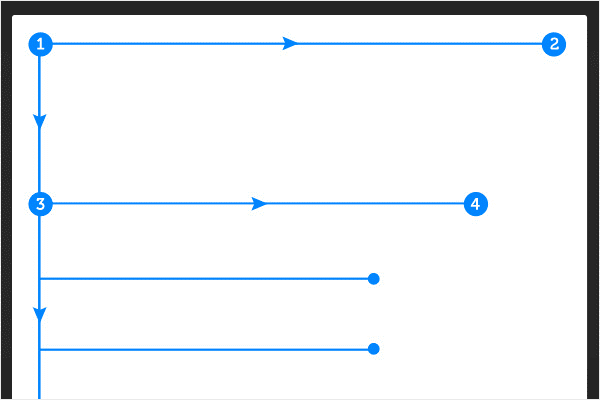
According to the heat map, people first begin viewing a website at the top, from left to right of the screen. They then proceed to browse the page downwards, working their way into the content.
As per the heat map, the bottom right of the website receives the least visibility.
This means for boosting conversion, the call to action must be placed strategically along the F line. It is advised that you place it on top, along with other important objects, like the logo, product list, etc.
- Optimize for the 8-second rule
Did you know that the attention span of humans is now even shorter than a goldfish? The average attention span stands at 8 seconds, and this too is fast shrinking.
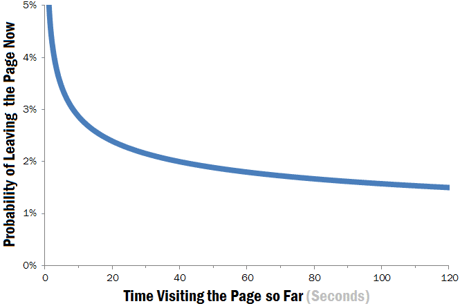
This means, as a brand, you only have 6-8 seconds to engage visitors before they abandon your website. You must create a web design that grabs their attention in this precious time, thereby ensuring that they stay long enough on your site to convert into customers.
To grasp the attention of your website visitors in less than eight seconds, do the following:
- Use a benefit-driven tagline that relays your main value proposition. Ensure that it is the first thing visitors see.
- Imagery is key. Use attractive, relevant, and high-quality images to get your point across. Infographics will help.
- Add power words and persuasive language in your web copy.
- Make your Call to Action button large and clear. Use the power of contrasting colors to make it stand out.
- Animated exit-popups can help in re-engaging those customers that have lost interest.
All in all, consider the first eight seconds of the user experience to be the most important one. Make sure that you are able to pitch your brand successfully in this time, to increase the chances of conversion.
- Include Social Share buttons
As per Statista, currently, there are 3.8 billion social media users! This means you are likely to find a significant share (if not all) of your target audience online.
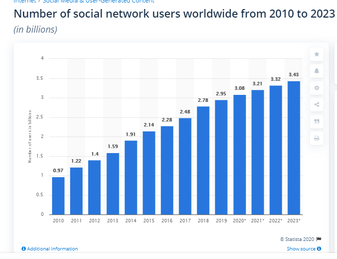
In case you have added a blog to your website, make sure to leverage the power of social media by including social share buttons on your site.
These buttons are present as small icons either on the top or the bottom of the post. Following the F-layout principle, we suggest you place it on the top portion of your content.
This allows website visitors to share your content on different social media account. In other words, it allows you to create brand advocates out of satisfied customers. So, one conversion can lead to multiple conversions.
This small element of web design can help in improving your site traffic and hence increases the chance of a conversion. Remember, never just rely on the search engine to generate traffic to your website. The world of digital media is much more than that. It is profitable to take it all into account.
Verdict
To wrap it up, here is a run-down of the six web design principles discussed:
- Place your logo strategically.
- Keep your web design short and simple.
- Optimize it for mobile
- Design according to the F-layout
- Optimize for the 8-second attention span of customers
- Add social share buttons.
With these six simple improvements, you now have a website that is ready to convert visitors into customers!
Now that your website is ready to make sure your products and branding are too! As they say, the conversion is not a one man’s job.
Are there any other improvements that can increase the chances of conversions? Let us know below.